Category: Design

  • Hide Away

    Hide Away

    Every so often, I get an “offer that I can’t refuse” to do some design work. Such was the case with a recent client — my talented sister, Kathleen O’Keefe.

    Take a look at the limited-edition digipaks for her new album, Hide Away, which just hit streaming services everywhere.

    Kathleen O’Keefe - Hide Away

    Kathleen O’Keefe - Hide Away - inside cover

  • Team Lightning Lab

    Team Lightning Lab Cycling Jersey

    As a cyclist, I’m always envisioning designs for cycling kit and being inspired by all the fantastic options out there. Sometimes I even take on a related project or two.

    While in New Zealand, I had the opportunity to design a jersey and bib for Lightning Lab (the brand for Creative HQ’s various acceleration programs). As I’m hoping to have the finished kit in-hand soon, I wanted to give a little sneak peek of what’s to come. (Thanks to Danny and the team at Ultimo for their eternal patience.)

    For more cycling and adventure-related content, don’t miss my latest activity on Instagram.

  • Socks For Robots

    Socks For Robots

    As a result of my recent partnership with the PR and marketing wizards at JDI, Apostrophe Industries is honored to be working with the new consulting brand, Socks For Robots.

    Evolving the identity with a revised logo, 3D treatments and a typography-driven site, it was a phenomenal experience to work with Rebecca and Corey — and be so welcomed as part of the SFR team.

    Learn about their integrated approach to design and marketing and hear more on the origin of Socks For Robots from Josh.

  • Rock That Font at SXSW

    One of our favorite creative endeavors is Rock That Font. More than a site that explores the intersection of typography and rock’n’roll, Rock That Font aims to provide a community platform for all to share their passion for album cover art.

    With the above goal of community in mind, I’m pleased to reveal that we’ll be hosting our next get-together as part of the official conference program at SXSW Interactive.

    Rock That Font Meet Up at SXSW
    Tuesday, March 17
    12:30pm – 1:30pm
    JW Marriott (110 E 2nd St), Room 501

    Visit SXSW.com for details on how you can attend the SXSW edition of our Meet Up, and make sure to join our general group via Meetup.com/Rock-That-Font.

    Hope to see you there.

  • Rock That Font Tees

    Sometimes you want to show your friends and associates that you are a font nerd, and sometimes you want to be a bit more discreet. The monochromatic, dark blue (Pantone 7546) on Indigo (Next Level Tri-Blend) Rock That Font t-shirt keeps things subtle and classy.

    Printed in Austin, Texas by our pals at Industry Print Shop.

    Want one? Head over to the Rock That Font store for details.

  • Apostrophe Cards

    I have an apostrophe in my last name. As a result, I have thwarted computer systems since birth.

    More recent parsing and coding techniques have fortunately helped my surname survive in the digital age, but it’s always mind-numbing to rinse and repeat: “Try your search without the apostrophe in my last name.” And not to mention: “Yes, the letter K is also capitalized.” Both thanks to my proud Irish heritage of course.

    After recently picking up a .industries domain and doing some research for my new company’s look and feel, I fell down into the typographic rabbit hole that is the apostrophe. I’m talking waaaaay deep into various Unicode characters, primes, acute accents and the long history of this somewhat controversial mark.

    “There is not the faintest reason for persisting in the ugly and silly trick of peppering pages with these uncouth bacilli.” – George Bernard Shaw, playwright and hater of the apostrophe

    It turns out that little key to the left of your “Enter” key really isn’t a true apostrophe. It’s a compromised mark that came into being with the typewriter for efficiency’s sake (a “typewriter apostrophe”). Computer keyboards inherited this character and expanded its usage to represent a number of marks. Encodings evolved. To now get a typographic apostrophe, you need to hit a few more keys on your computer keyboard. “Shift + Option + ]” on a Mac and “Alt + 0 1 4 6” on a number pad for Windows. #themoreyouknow

    Apostrophe Business Cards 
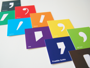
In developing new business cards for Apostrophe Industries, I wanted to make something that evoked creativity and perhaps had some value outside of just my contact information. Instead of a standard card, I decided to create a set of ten unique cards — each showcasing a particular typeface’s apostrophe (blown up to approximately 350 pt). Referencing FontShop’s 100 Best Typefaces of All Time, I selected a few of my faves that were visually distinct and of historic significance:

    1. Helvetica
    2. Bodoni
    3. Futura
    4. Times
    5. Gill Sans
    6. Univers
    7. Optima
    8. Franklin Gothic
    9. DIN
    10. OCR A

    I’m thrilled with how they turned out. The cards are a great conversation piece and often lead to a rather geeky discussion about my passion for design and projects such as Rock That Font.

    Just don’t get me started on “smart quotes.”

  • Jersey Project

    For what seems like eons, I’ve wanted to put together a cycling jersey for the South By Southwest staff to better represent at charity rides and races.
    (more…)

  • rockthatfont.com v2.0

    rockthatfont.com Call it “2.0” or whatever buzzword of your choosing, but I’m excited to reveal that we recently launched a new site design for rockthatfont.com.

    We’ve implemented Typekit and a highly-customized premium WordPress theme from Shaken & Stirred. We hope this design will allow you to more easily deep-dive into our archived content and enjoy the splendor of the album covers themselves.

    Things are still very much a work in progress, so please don’t hesitate to let me know your thoughts and feedback.

  • slides from “the typography of the bicycle”

    The Typography of the Bicycle

    Last May at WebVisions, I gave a 5 minute presentation entitled, “The Typography of the Bicycle.” The idea was to take a similar journey of discovery as with Rock That Font, but instead of album covers, explore the typography of some of my favorite bicycles.

    The hilarious part is that right before jumping on the stage, I realized there was no clicker available to control my slides (they were to be auto-advanced in the traditional Ignite format) — and I had waaaay too many slides for the allocated time. As a result (and at approximately 7 seconds a slide), the presentation turned into a bit of a crazy and fun rant.

    In any case, I’ve received a few requests for the slides, so I finally got around to digging them up.

    (The names in the lower right corner of each slide are Flickr usernames — make sure to explore each of the photographers’ amazing work).

  • rock’n’roll + typography = rockthatfont.com

    rockthatfont.com why have i been so quiet as of late? well, i’d like to introduce you to one of those reasons: rockthatfont.com

    it’s a fun little project that i’ve had in the works for quite some time. a big hug to pals eric hurtgen and les jacobs for joining me on this adventure.

    explore the site and let us know what you think. then keep an eye out for some new community-based shenanigans in the near future — as we still have a few tricks up our, uh… sleeves.