Author: Shawn

  • across the pond

    Just a quick note that I’m in Europe this week speaking at a few conferences…

    The first will be a 20-minute presentation and Q&A on next-generation crowd-sourcing tomorrow at Futur en Seine. (My first experience building a presentation with Prezi, which we used for the SXSW Interactive Awards in March — and so far I only have very nice things to say about it.)

    Presentation in Prezi

    Building Collaboration Frameworks for Success
    From design competitions to raising capital to event programming, the innovative and controversial concept of crowd-sourcing is impacting all sectors of digital industry. Learn how to avoid exploitsourcing and appropriately build a collaboration framework for your community that leads to success for all parties involved.

    Next up will be a trip to Germany for c/o Pop and the C’n’B convention. There will be a SXSW-focused panel and reception on Thursday evening, then I’m honored to be joining a group of conference organizers on Friday for a panel session called “International Networks III: Conferences – Networked Out?”

    So if you find yourself in Paris or Cologne, stop on by and say hello (or “Bonjour” or “Guten Tag” as the case may be.)

    Now to put the finishing touches on that presentation.

  • somewhat recently

    This is the time of year when, for better or worse, almost all my time and energy is focused on planning SXSW — which I dare remind myself is only three weeks away. In an effort to better archive my activities, I wanted to take a moment and share some recent media before my brain turns to complete mush…

    » My “Who Gives A *!%# About Typography?” rant at Ignite Austin about Rock That Font.

    » An archive of my January 24th appearance on The Brian Lehrer Show in NYC.

    » A brief article I put together for TalentZoo titled, “Look Into the Future With Collaborative Frameworks” — inspired by my panel session at the MTO Summit in D.C. with Toby Daniels and Michelle Bruno.

    » An archive of my live chat with cohort Kelly Krause and Omar Gallaga from The Austin American-Statesman about SXSW Interactive.

    » And finally, I have a new post up on Rock That Font about The Hold Steady’s latest effort, Heaven is Whenever. Thanks to nicest-guy-in-Austin Christian Helms for sharing a bit about his creative process.

    More soon. I promise.

  • slides from “the typography of the bicycle”

    The Typography of the Bicycle

    Last May at WebVisions, I gave a 5 minute presentation entitled, “The Typography of the Bicycle.” The idea was to take a similar journey of discovery as with Rock That Font, but instead of album covers, explore the typography of some of my favorite bicycles.

    The hilarious part is that right before jumping on the stage, I realized there was no clicker available to control my slides (they were to be auto-advanced in the traditional Ignite format) — and I had waaaay too many slides for the allocated time. As a result (and at approximately 7 seconds a slide), the presentation turned into a bit of a crazy and fun rant.

    In any case, I’ve received a few requests for the slides, so I finally got around to digging them up.

    (The names in the lower right corner of each slide are Flickr usernames — make sure to explore each of the photographers’ amazing work).

  • who gives a *!%# about typography?

    Records

    While I am by no means an expert on typography (very few folks are in my opinion), I do love to share my passion for it.

    Tomorrow night I will get exactly that opportunity, as I am very honored to be participating in the second annual Ignite Austin.

    Who Gives A *!%# About Typography?
    Rock ‘n roll. Typography. Two subjects that many believe shouldn’t be mentioned in the same breath. I beg to differ. Come hear what happens when you dare to combine the two.

    If you are in town, come on down to The Phoenix to hear how Rock That Font got started, get a dose of inspiration from the intersection of rock’n’roll and typography, and see the words that surround you in a new light.

    Hope to see you there.

  • the tangled social web we weave

    I’m always surprised when folks inquire about whether or not to integrate social media platforms such as Twitter and Facebook into their website. Many still express a concern for control, not realizing that their community likely shapes their brand more than they do. And for 9 out of 10 of these concerned clients, these online platforms are where most of their target audience is spending their time. Shaping (or not shaping enough as the case may be) identities 24/7, 365 days a year.

    If you are not actively collaborating with your community to develop your product, service or experience — you are behind the ball. In this day and age, your clients/customers/consumers expect nothing less than a two-way street.

    After all, it’s what good relationships are made of.

    With this approach in mind, I wanted to give a quick heads up that Rock That Font has recently added a new Facebook page to better foster community interaction and discussion (along with our Twitter account of course).

    Feel free to spark a discussion about your favorite records and fonts, as well as give us some “Like” if you so desire.
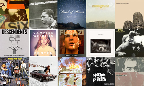
  • rocky mountain high, colorado

    It’s true… I lost my karaoke virginity to a John Denver tune in Baton Rouge, Louisiana. It was a week before his tragic death in 1997.

    The song was “Take Me Home, Country Roads” — which happened to be one of my late grandmother’s favorite songs (being that she grew up in West Virginia of course). There was also some Neil Diamond involved, but perhaps those scandalous details are best left for another time.

    In any case, it turns out that I’m headed to Colorado this weekend. Boulder to be exact.

    I’m honored to be giving a six-minute TEDxBoulder talk entitled “Psychotherapy for Community” — where I will reveal some secret sauce on how to better manage your community, run your business and ultimately transform your life.

    Hope to see you there.

  • rock’n’roll + typography = rockthatfont.com

    rockthatfont.com why have i been so quiet as of late? well, i’d like to introduce you to one of those reasons: rockthatfont.com

    it’s a fun little project that i’ve had in the works for quite some time. a big hug to pals eric hurtgen and les jacobs for joining me on this adventure.

    explore the site and let us know what you think. then keep an eye out for some new community-based shenanigans in the near future — as we still have a few tricks up our, uh… sleeves.

  • when is a design worth saving?

    great design is often loved by some — and hated by many others. but regardless, it provokes.

    scirocco such is the case with my recent purchase of a 1978 volkswagen scirocco champagne edition ii. the amount of surface rust and missing parts really puts the project in project car, aesthetically challenging my neighbors even as it sits covered in my driveway. despite significant issues (the previous owner was attempting to create the ultimate scca race car) and my love/hate relationship with cars due to their environmental impact… i believe it to be well worth saving.

    the scirocco was designed by giorgetto giugiaro, named car designer of the century in 1999. from wikipedia:

    “Noted initially for such sensuous efforts as the Ferrari 250 Berlinetta Bertone, De Tomaso Mangusta, Iso Grifo and Maserati Ghibli, Giugiaro switched courses to introduce the highly angular ‘folded paper’ era of the 1970s. Straight lined designs such as the BMW M1, Maserati Bora, and Maserati Merak followed before a softer approach returned in the Lamborghini Cala, Maserati Spyder, Ferrari GG50.”

    in addition to various supercars and a laundry list of popular everyday cars, giugiaro has designed nikon camera bodies, computer prototypes for apple and even a new pasta shape called “marille” in 1983.

    future plans for my particular specimen include new tires, a non-cracked windshield, an actual dashboard, some seats, and potentially a tdi engine swap to run biodiesel. a ginormous amount of tlc will be required to get it streetable again, but i think i just might be up for the challenge.

    one less car in the landfill, particularly if a special and rare design, is a good thing in my book.

  • no time like the presentation

    a quick thanks to everyone who came out this evening for my little presentation on sxsw interactive at the austin forum. i was honored to pinch hit for hugh.

    note to self: i have been informed that pie charts are no longer cool. or at least, not good data visualization… to which i must wholeheartedly agree. hmm… if only there was more time and sleep available as of late.

    in any case, i thought i would share my slides — successfully created at the very last-minute thanks to sliderocket


  • look ma, no ink with austin laser art

    laser-etched biz card
    this post officially ends my blogging hiatus. thought i would once again start sharing a bit more on the interwebs, at least in batches longer than 140 characters…

    even though i’m short on time these days, i love busting out small / personal / miscellaneous design projects when i get the chance. i thought i would take a moment to share one of my latest…

    laser-etched business cards rather than do the awesome-but-familiar moo cards, i wanted to make a little business card with just my personal contact information.

    years ago i whipped up a card via a web vendor and ended up with a fancy plastic card. it was dark transparent gray with white text in agency bold (a font by david berlow from atf agency gothic by morris fuller benton). sure the plastic cards looked pretty cool, but they had the sharpest corners ever. you couldn’t write on them, but boy you could use them as a weapon if absolutely necessary. super-cool looks + lack of practical functionality = fail.

    this time around i wanted to get it right. parameters included: ability to write on the card, eco-friendly paper and ink (or lack thereof), and possibility for card recipient to easily pass along my contact information if so desired (double-sided / tear in half). i picked up some nice stock from french paper (their blog is a great source of inspiration) and developed a few variations using stainless extended.

    special thanks to aaron haley at austin laser art. can’t recommend his services highly enough.