I have an apostrophe in my last name. As a result, I have thwarted computer systems since birth.
More recent parsing and coding techniques have fortunately helped my surname survive in the digital age, but it’s always mind-numbing to rinse and repeat: “Try your search without the apostrophe in my last name.” And not to mention: “Yes, the letter K is also capitalized.” Both thanks to my proud Irish heritage of course.
After recently picking up a .industries domain and doing some research for my new company’s look and feel, I fell down into the typographic rabbit hole that is the apostrophe. I’m talking waaaaay deep into various Unicode characters, primes, acute accents and the long history of this somewhat controversial mark.
“There is not the faintest reason for persisting in the ugly and silly trick of peppering pages with these uncouth bacilli.” – George Bernard Shaw, playwright and hater of the apostrophe
It turns out that little key to the left of your “Enter” key really isn’t a true apostrophe. It’s a compromised mark that came into being with the typewriter for efficiency’s sake (a “typewriter apostrophe”). Computer keyboards inherited this character and expanded its usage to represent a number of marks. Encodings evolved. To now get a typographic apostrophe, you need to hit a few more keys on your computer keyboard. “Shift + Option + ]” on a Mac and “Alt + 0 1 4 6” on a number pad for Windows. #themoreyouknow
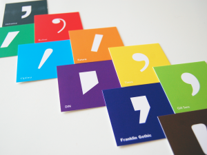
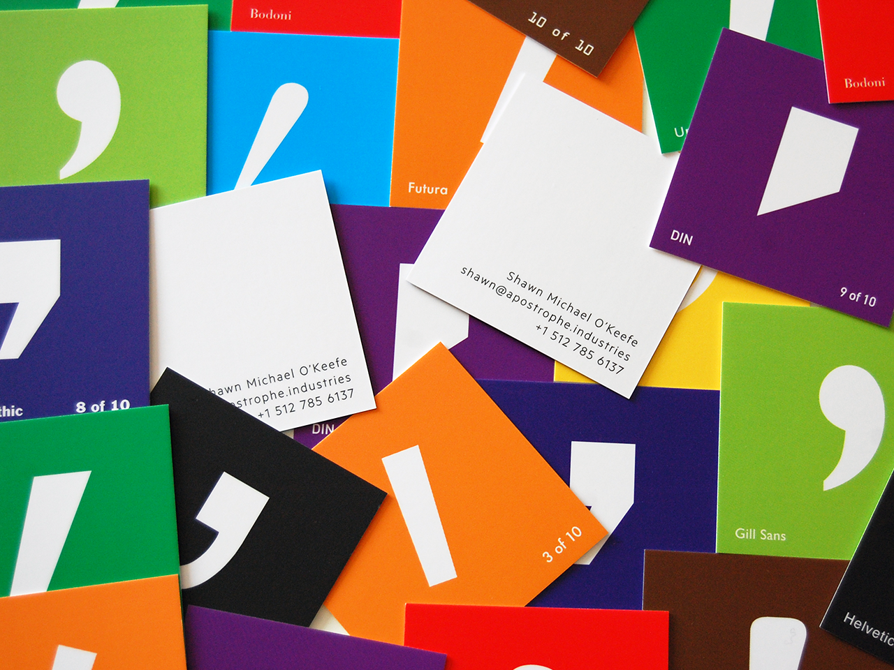
 In developing new business cards for Apostrophe Industries, I wanted to make something that evoked creativity and perhaps had some value outside of just my contact information. Instead of a standard card, I decided to create a set of ten unique cards — each showcasing a particular typeface’s apostrophe (blown up to approximately 350 pt). Referencing FontShop’s 100 Best Typefaces of All Time, I selected a few of my faves that were visually distinct and of historic significance:
- Helvetica
- Bodoni
- Futura
- Times
- Gill Sans
- Univers
- Optima
- Franklin Gothic
- DIN
- OCR A
I’m thrilled with how they turned out. The cards are a great conversation piece and often lead to a rather geeky discussion about my passion for design and projects such as Rock That Font.
Just don’t get me started on “smart quotes.”


This is seriously geeky. In a good way.